Good Morning, Noble Managers! It’s Wednesday, July 9.
Topic: Economic Analysis | Yield Curve Interpretation | Strategic Planning
For: B2B and B2C Managers.
Subject: Economics → Practical Application
Concept: Use the yield curve to anticipate economic shifts
Application: Convert bond market signals into actionable plans for inventory, hiring, and expansion
Don’t keep us a secret. Share this newsletter with friends (copy URL here).
TL;DR:
Why the yield curve beats GDP, predicting recessions 12–18 months ahead
How to read Normal, Flat, and Inverted curves and act on them
Ray Dalio’s warning: High 2025 yields may signal debt risks, not growth
Introduction
In July 2025, with the 10-year Treasury yield at 4.34% (down from 4.48% in June, per FRED) and new tariffs on $200 billion in Chinese imports fueling economic uncertainty, managers can’t afford to wait for lagging indicators like GDP reports.
The yield curve—a graph of Treasury yields across maturities—has predicted 7 of the last 8 U.S. recessions, giving you a 12–18 month edge to adjust inventory, hiring, or expansion.
Unlike economists’ jargon, the yield curve is your real-time economic GPS, reflecting what investors with trillions at stake expect for growth, inflation, and risk.
Let’s unpack why this matters and build a framework to turn bond market signals into your competitive edge.
Bond 101: Why Bonds and Yields Matter
What’s a Bond?
A bond is an IOU (I Owe You).
Buy a $1,000 (Par Value) 1-year Treasury bond with a 5% coupon rate, and the government pays you $50 in annual interest, returning your $1,000 at maturity.
The Yield Formula:
Yield = (Coupon Payment + Capital Gain/Loss) ÷ Purchase Price
Case 1: Buy at $950 (Market Value < Par Value)
Yield = ($50 interest + $50 gain) ÷ $950 = $100 ÷ $950 ≈ 10.53%
Case 2: Buy at $1,000 (Market Value = Par Value)
Yield = ($50 interest + $0) ÷ $1,000 = $50 ÷ $1,000 = 5.00%
Case 3: Buy at $1,050 (Market Value > Par Value)
Yield = ($50 interest – $50 loss) ÷ $1,050 = $0 ÷ $1,050 = 0%
The Inverse Relationship:

When bond prices fall, yields rise.
When bond prices rise, yields fall.
Why? The coupon is fixed, so a cheaper bond boosts your return (via capital gain), while an expensive bond shrinks it.
Why This Matters:
Yields reflect investor behavior.
When investors expect growth, they sell bonds (yields rise). When they fear slowdowns, they buy long-term bonds for safety (yields fall).
This dynamic drives the yield curve, your window into the economy’s future.
Key Takeaway: Bond prices and yields move in opposite directions.
The Yield Curve: Your Economic GPS
What It Is:
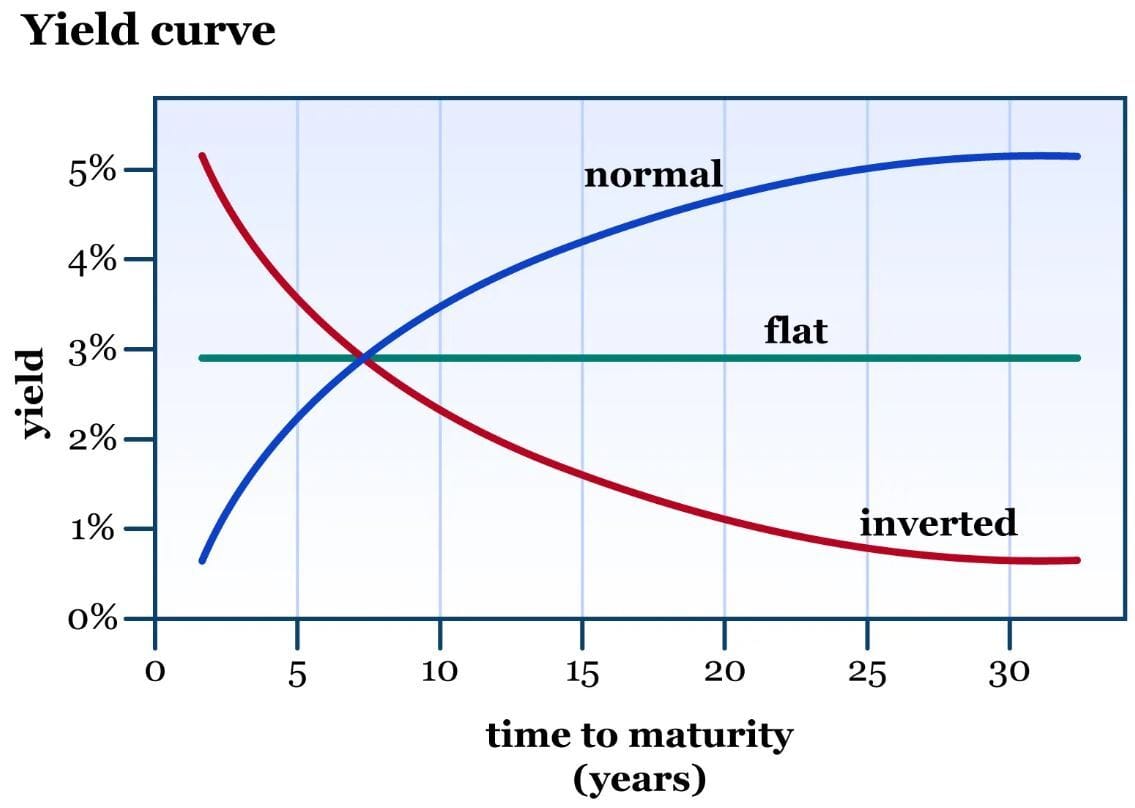
The yield curve plots yields of U.S. Treasury bonds across maturities (1-month to 30-year).
In a normal scenario, we expect the economy to grow. This means we will have some expectation of gradually increasing inflation, and so interest rates will rise accordingly to keep the inflation under control.
Yield Curves:
Normal (Upward-Sloping): Long-term yields > short-term yields (e.g., +1% to +3% spread).
Why: Investors expect growth and mild inflation, demanding higher returns for longer commitments (risk compensation).
Signal: Green light for expansion.
Flat: Long-term and short-term yields nearly equal (e.g., 0% to +0.99% spread). Why: Uncertainty about growth, often tied to rising risks like tariffs or debt.
Signal: Yellow light—proceed cautiously.
Inverted (Downward-Sloping): Short-term yields > long-term yields (e.g., negative spread).
Why: Investors expect short-term rate hikes (→ ST bond prices fall → ST yields rise) but long-term slowdown, buying long-term bonds for safety (→ LT bond prices rise → LT yields fall).
Signal: Red light—recession likely within 12–18 months.
2025 Situation:
2-year yield = 3.75%, 10-year yield = 4.34% (FRED, July 7, 2025).
Spread = 4.34% – 3.75% = +0.59% (Flat, Yellow signal).
Interpretation: The market sees uncertainty, possibly due to tariff-driven inflation (3.1% PCE) and rising debt risks.
Why this matters: The yield curve reflects investors’ collective bets: “Growth ahead” (Normal) or “Brace for trouble” (Inverted). A flat curve, like today’s, warns of risks—act before it’s too late.
Yield Spread: Your Crystal Ball
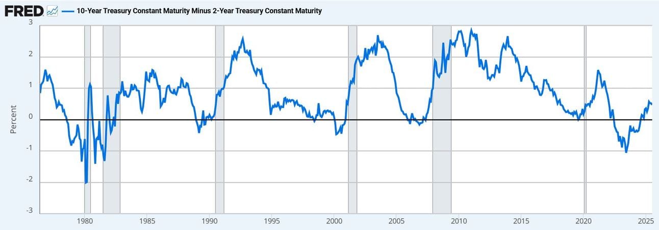
The 10-year minus 2-year spread (10-2 spread) is the key indicator.
The yield spread curve isn’t just a chart—it’s the bond market’s trillion-dollar vote on the economy’s future.
When short-term yields (e.g., 2-year Treasuries) exceed long-term yields (e.g., 10-year Treasuries), creating an inverted curve, it signals investors expect trouble—often a recession—within 12–18 months.
Why? Investors rush to long-term bonds for safety, driving their prices up and yields down, while avoiding short-term bonds, pushing their yields higher.
This inversion has predicted 7 of the last 8 U.S. recessions (gray areas in the chart) since 1955, with only one false positive.
Case Study:
In 2019, an inverted yield curve warned of the 2020 recession. Retail giant Target monitored the 10-2 yield spread as it inverted and acted early, cutting inventory by 15% and preserving $500M in cash flow, while competitors like Macy’s, ignoring the signal, overstocked and lost 20% of margins in the 2020 recession.
Why this matters: The yield curve spots trouble before your competitors do, giving you time to pivot while others react to outdated GDP data.
Tactical Tool: Yield Spread Scorecard
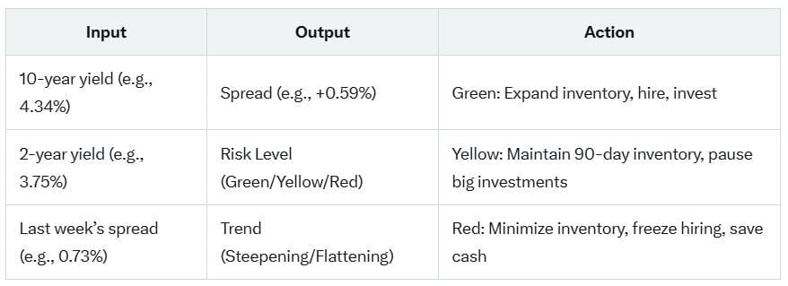
Our Yield Spread Scorecard helps you assess economic risk and align your strategy.
What the Tool Does:

Steps:
Check the Spread: Visit FRED for 10-year (DGS10) and 2-year (DGS2) yields. tools.
Classify the Signal:
Green (Normal): +1.0% or higher → Expand confidently
Yellow (Flat): 0% to +0.99% → Proceed cautiously
Red (Inverted): Below 0% → Protect cash flow
Track the Trend: Compare weekly spreads to detect steepening (optimistic) or flattening/inverting (pessimistic).
The Manager Yield Curve Playbook: 5 Steps
Turn yield curve signals into business decisions with this 5-step playbook:
Step 1: Monitor Weekly
Check the 10-year minus 2-year spread every Friday on FRED. Note trend (steepening/flattening).
Step 2: Contextualize Signals
Are high yields (e.g., 4.34%) driven by growth (e.g., 3.9% unemployment, per BLS) or risks (e.g., 130% debt-to-GDP, tariff inflation)? Cross-check PMI or earnings reports.
Step 3: Translate to Strategy
Normal (Green): Build inventory, hire aggressively, expand markets.
Flat (Yellow): Maintain 90-day inventory, hire critical roles, pause big investments.
Inverted (Red): Minimize inventory, freeze hiring, prioritize cash reserves.
Step 4: Adjust Operations
Align inventory, staffing, and capital with the signal. Example: Flat curve = reduce inventory to 90 days.
Step 5: Communicate Clearly
Tell your team, “The yield curve is [normal/flat/inverted], signaling [outlook]. We’re [specific actions].”
Downloadable Tool: Use our Yield Curve Action Checklist to guide your planning.
Critical Insight: Ray Dalio’s Warning
Ray Dalio warned in 2025: “High yields reflect debt concerns, not growth.” Here’s how to differentiate:
Growth-Driven Yields: Strong jobs (3.9% unemployment, June 2025), rising earnings, Fed tightening.
Risk-Driven Yields: Fiscal deficits (CBO projects $3T added debt by 2035), tariff inflation (core PCE at 3.1%), trade tensions (e.g., 25% China tariffs, June 2025).
Manager Takeaway: Don’t misread high yields as a green light. A flat curve (+0.59%) in July 2025, with tariffs and debt risks, demands caution, not expansion.
What’s Your Yield Curve Risk Level?
Take our Yield Spread Scorecard link and share your risk level (Green, Yellow, Red) on X.
Are you seeing growth signals or debt warning signs in 2025 yields? Reply or post to join the discussion!
Top Links to Deep Dive
Want to go beyond today’s breakdown? Here are the best resources to master this topic:
FRED – 10-Year Yield Curve. Link here.
FRED – 10-2 Year Yield Spread. Link here.
Investopedia – Yield Curve: What It Is and How to Use It. Link here.
WP Finance LLC – US Treasuries Yield Curve. Link here.
Time – Ray Dalio: We Need to Cut the Budget Deficit Now. Here’s How We Do It. Link here.
McKinsey – A better way to anticipate downturns. Link here.
Gies College of Business – FIN 571: Money and Banking. Link here.
Final Thought
The yield curve is the bond market’s trillion-dollar signal—spot trouble or opportunity before your competitors. Read it like a manager, not an economist, and stay one step ahead.
Until next time, keep innovating—and keep it noble!
Filippo Esposito
Founder, The Noble Manager


